Welcome to Vibra News
Insights, tips and inspiration on colors, branding and design workflows.
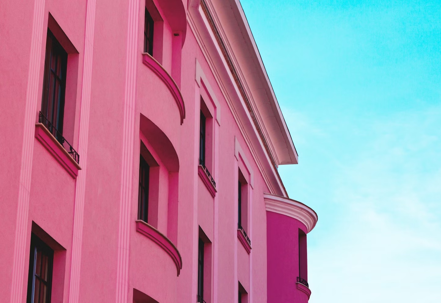
Summer Moods in Color: Exploring the "Shades" and "Pinks" Collections
Vibrant summer moods captured in two new color palette drops — SHADES and PINKS. Handpicked from the Vibra color gallery and now featured on TikTok, these palettes explore emotion, nostalgia, and seasonal design energy.
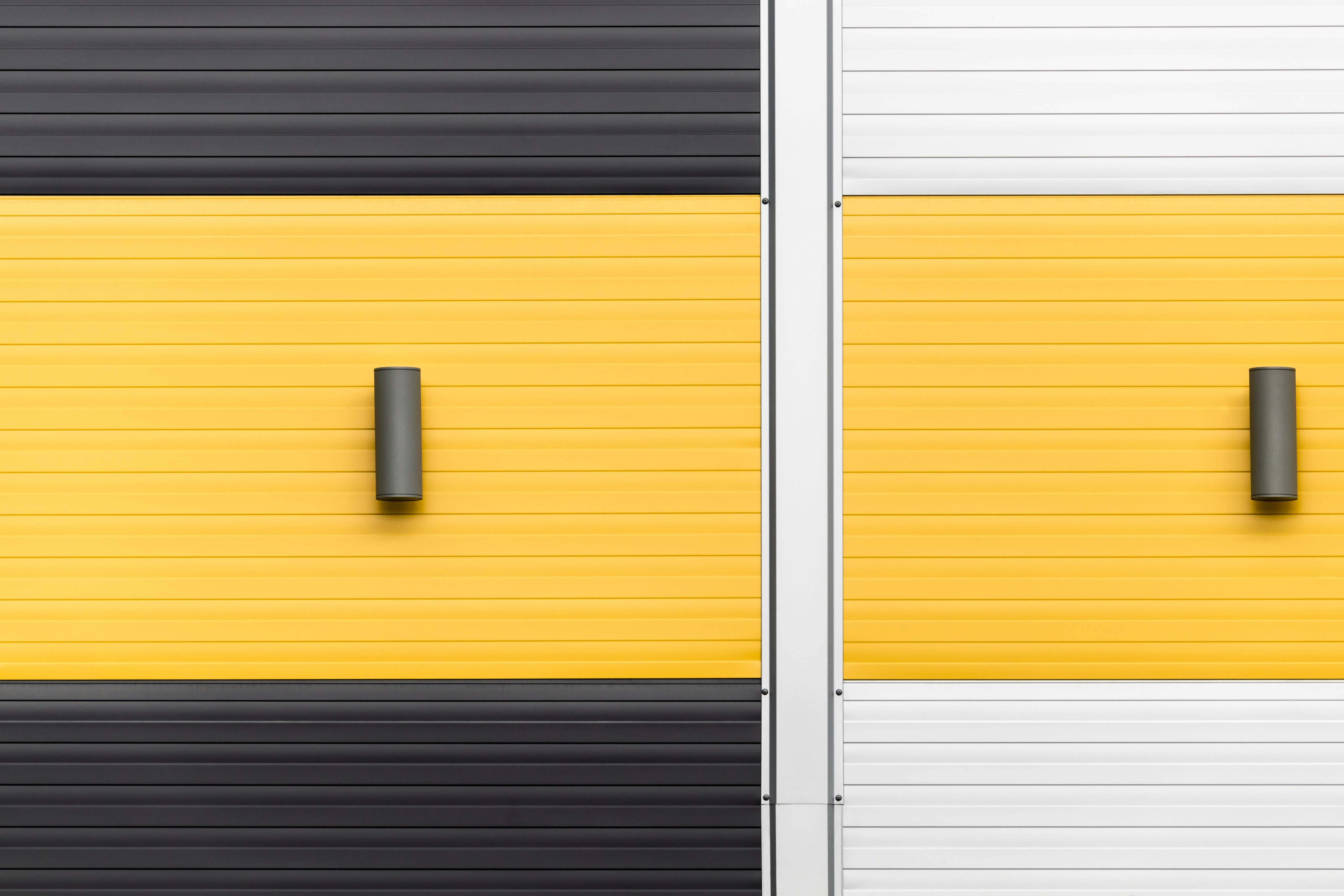
Color Is Your First UX
Color is doing emotional work before your layout or copy ever has a chance. It’s not a final layer — it’s the first signal users feel. If you're treating color as decoration, you’re ignoring your most powerful UX tool.
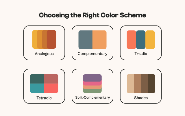
How to Choose the Right Color Harmony: A Designer’s Guide to Vibra’s 6 Systems
Learn how to choose the right color harmony for your design using Vibra. From bold contrasts to subtle shades, this guide walks you through six essential schemes to help you create visually powerful and emotionally resonant palettes.
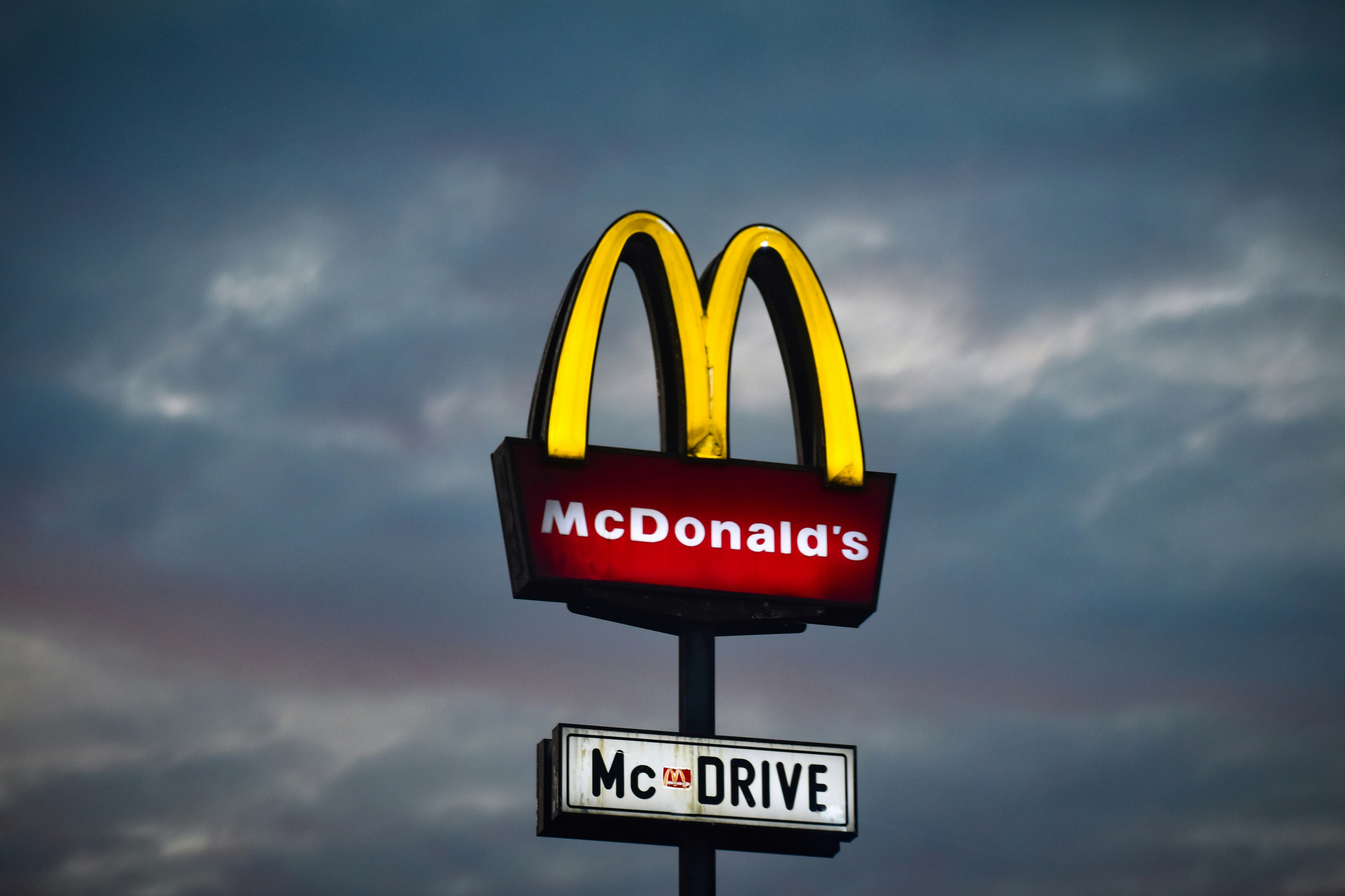
From Playful Red to Corporate Green: What McDonald's Color Shift Really Says
McDonald’s recent shift from bright reds and yellows to muted greens and browns reflects more than just a visual makeover — it signals a deeper tension between branding, nostalgia, and ethical storytelling.