As part of my exploration into summer design, I’ve shared two color stories on the Vibra TikTok channel: one called SHADES and the other, a dreamy follow-up called PINKS. Each of them is built from my own color gallery on the Vibra web app — a place where I’ve been collecting combinations that feel real, intentional and creatively usable.
The Shades Collection
SHADES started as a simple idea — what happens when you take a single base color and explore it in five directions? Not just in saturation or contrast, but in mood. The three base shades I chose were Olive Green, Golden Yellow and Cornflower Blue. Each of them reflects a different summer archetype.
Olive Green is grounded and mature. It’s perfect for packaging, branding, or web design with an organic or eco-forward message. The range moves from pale sage to dark forest, offering flexibility in tone and depth.
Golden Yellow captures warmth, tradition and joy. It’s the color of ripe fruit, late sunlight and glowing textiles. You might use this palette in editorial layouts, food photography overlays, or sunny landing pages.
Cornflower Blue is cooler and more digital. This one moves easily between professional and nostalgic, especially when layered with gradients or used in UX/UI. It’s the perfect blue to balance summer heat with clarity.
@vibra.tools All pulled from my color gallery on vibra.tools 🎨 Made to help you explore, save or build your own. Got a fav? Drop it 👇
♬ . - <3
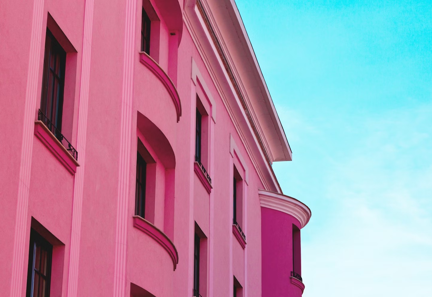
The Pinks Collection
PINKS is where things get emotional. These palettes are personal, expressive and slightly surreal. They’re built for visual storytelling, posters, album covers, beauty brands and even product design.
The three palettes — Candy Skies, Neon Garden and Velvet Memory — each evoke something different. Candy Skies feels like a sunny road trip through 90s cartoons. Neon Garden is a digital forest glowing with glitchy flora. Velvet Memory is cinematic, like walking into a dusty theatre in a forgotten love story.
These aren’t just palettes that look nice together. They carry stories. And that’s what makes them powerful.
@vibra.tools All pinks pulled from my collor gallery @ vibra.tools Save for color inspo 🎨 #fyp
♬ 7AM - Slowed + Reverb - Adrian
Why Summer Palettes Matter
Designers, artists and creators are always searching for the right mood. Summer offers boldness, warmth and clarity — qualities that clients and audiences crave. Whether you're designing social posts, event branding, app UI, illustrations or personal projects, summer palettes help ground your work in a seasonal moment.
I created these palettes not just for aesthetics but for function. Each tone was tested for contrast, accessibility and versatility. You can find all of them, including HEX codes, on the Vibra TikTok Channel. They're free to use and open to interpretation.
Explore, Save and Remix
Both SHADES and PINKS are now live on TikTok. More are coming, and feedback is always welcome. If you use any of the colors, tag me or send a message — I'd love to see your work or hear your thoughts.
✨ Come play with color.