At first glance, a rebrand is often seen as cosmetic. A new logo, a fresher tone, maybe a change in packaging. But when McDonald's, a global emblem of fast food and childhood familiarity, began replacing its iconic red and yellow color scheme with deep greens and earthy browns, the message went beyond surface design. It became about legacy, perception, and reframing trust.
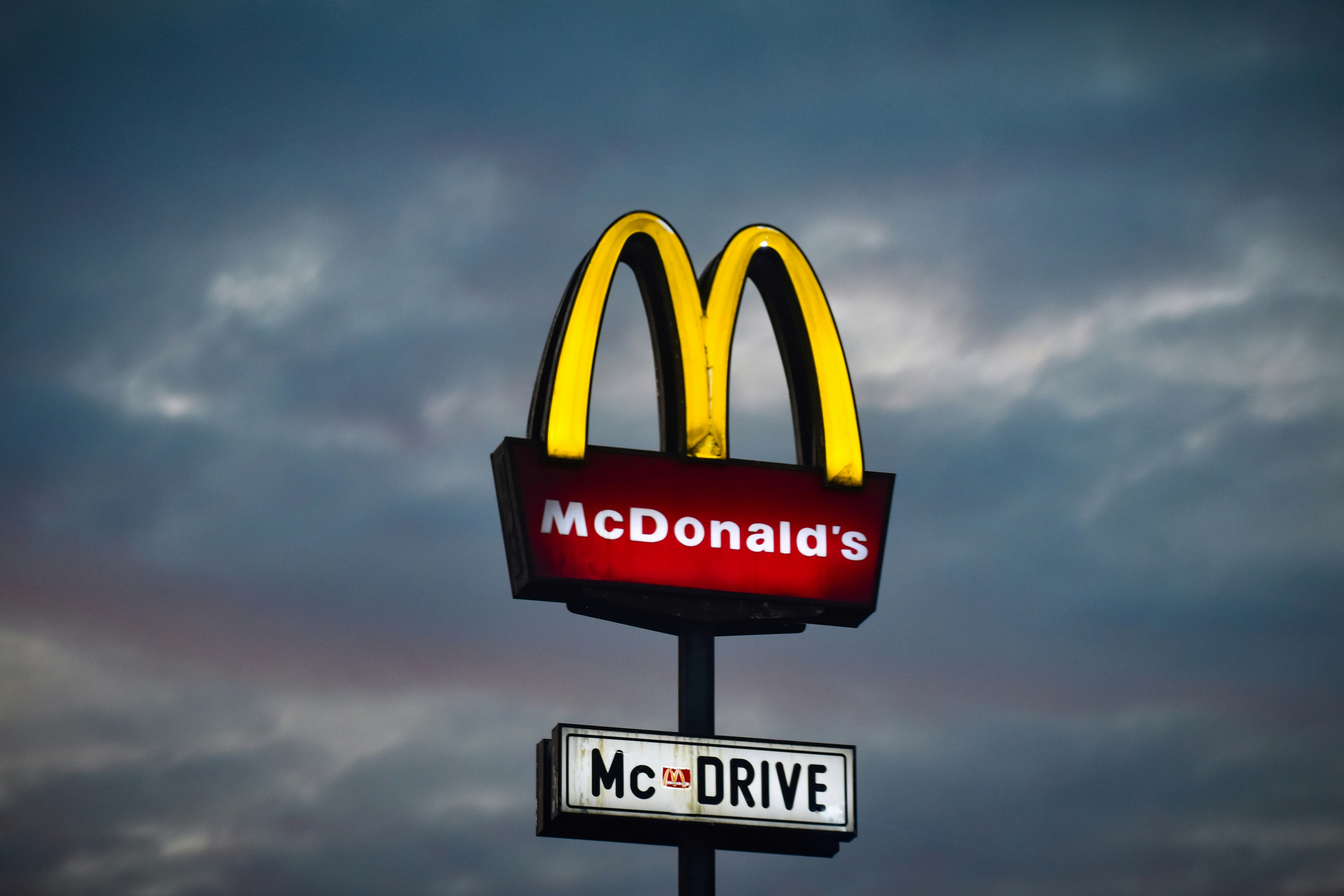
For decades, red and yellow told a story of speed, affordability, and immediacy. These colors were not accidental. They stimulated appetite and encouraged fast decisions. They also evoked joy, the kind associated with Happy Meals, birthday parties, and road trip stops.
Now that joy is being repackaged.
Across Europe, and increasingly in other regions, McDonald’s has introduced darker greens, wooden textures, and more subdued typography. These choices signal maturity. They suggest a cleaner, more conscious brand. In place of the carnival atmosphere is a setting that resembles a cafe or an eco-conscious eatery. This shift in tone reflects a broader strategy to adapt to changing cultural expectations.
Green, in visual communication, implies health, sustainability, and calm. It encourages the idea of care. With this new palette, McDonald’s appears to align itself with environmental values and ethical responsibility. The change suggests that the company is responding to global concerns about food systems, climate, and wellness.
But the core menu remains largely the same. The addition of salads and paper straws does little to change the nutritional and ecological impact of mass-produced burgers and fries. The rebrand becomes less about real transformation and more about aesthetic positioning.
There is also something lost in the process. The old red and yellow scheme was not just corporate identity. It was embedded in cultural memory. It was how children recognized a treat from the backseat of a car. It was a landmark on family vacations. Stripping it away introduces emotional distance. The brand feels different, and not everyone finds that comforting.
Interestingly, the transition is not consistent worldwide. While many European locations have embraced the new look, restaurants in the United States have kept their original colors. This variation speaks to how McDonald's tailors its image to local audiences. The global brand remains, but its expression shifts according to region.
Perhaps the most lasting impact of the redesign is how it influenced other fast-food chains. Burger King simplified its logo and leaned into nostalgia. Subway softened its greens and added more neutral tones. Starbucks refined its stores with more wood, less plastic, and an overall muted presence. These changes reflect a wider trend in branding — one that uses visual cues to express moral alignment, even when the core business remains unchanged.
McDonald’s rebrand is about more than color. It reflects a tension between the image a company wants to project and the substance of its operations. When aesthetics evolve faster than values, brands risk creating a gap between appearance and reality.
Consumers today are more visually literate and more skeptical. They notice when a message feels inconsistent. And in a world saturated with design, authenticity becomes harder to fake.