Before anything is clicked, before anything is read, color is already doing its job.
We like to think of user experience as a process. Wireframes, user journeys, clean component libraries, naming conventions. We love the idea that things are rational, structured, layered.
But design is rarely that polite. Most users don’t wait patiently to understand what we’ve built. They don’t study our hierarchy. They just... react. Emotionally. And usually within milliseconds.
That’s where color comes in. It’s not a cherry on top. It’s the greeting. The tone of voice. The mood before any content is even read.
We treat it like an accessory. It’s not.
Too often, color is still treated like something to “decide later.” After the wireframes. After the buttons are in place. As if it’s a background decision. A style coat.
But the truth is — color is doing emotional labor long before layout or copy ever has a chance.
It tells the user: are you safe here? Is this professional? Playful? Cheap? Clinical? It’s not a logical conversation. It’s a gut check. And guts speak first.
This is why Don Norman’s Emotional Design still hits. He reminded us that people don’t just use products. They feel them. And when something looks wrong — even slightly off-color — it doesn’t matter how intuitive your flow is. People won’t even begin the interaction. They’ll just bounce.
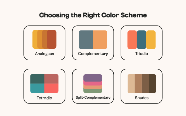
Color is relational, not absolute
Josef Albers said that no color lives in isolation. You never just see “red.” You see red next to something. That’s what makes color so tricky — and so interesting.
I’ve seen product teams fight for weeks over the “right blue,” completely ignoring that the background is making it feel cold or heavy or inaccessible. Color isn’t a soloist. It’s a string quartet. Context is everything.
Which is why picking a color from a mood board and dropping it into your interface is a bit like pulling a sentence out of a novel and expecting it to hold the same weight. It won’t. Design lives in relation.
Color is not universal — and that’s the point
Another trap is believing that color is some kind of universal emotional system. That red always means danger. That blue always means trust. That black is elegant and yellow is cheerful.
Leatrice Eiseman from Pantone has done great work cataloguing these common associations, but even she’s careful to say: context is culture. Color carries memory. A shade of yellow might mean hope in one place, and political unrest in another. Designers ignore these signals at their peril.
But that’s also what makes it powerful. Color has baggage. You’re never working with a blank slate — and that’s a good thing. That’s design vocabulary. Your job is to learn how to speak it, not erase it.
There’s no excuse for lazy color choices
And here’s where I’ll be blunt: lazy color choices are design malpractice.
Not testing your palette for accessibility? Unacceptable. Relying on red/green states without any supporting iconography or text? Negligent. Choosing brand colors that don’t meet contrast standards, just because “marketing liked them”? That’s not creativity — that’s vanity.
Design is visual, yes. But it’s not just visual. It’s functional, social, ethical.
We don’t just paint interfaces. We shape perception.
This isn’t just trivia — it’s fuel. It’s a reminder that color carries weight. Your palette choices are never neutral. They’re design decisions loaded with meaning.
And if that makes you uncomfortable, good. That means you’re taking the job seriously.
So, where do we start?
Don’t start with hex codes. Start with how you want people to feel. Do you want them to slow down? Feel safe? Get excited? Then build a color system that leads with feeling, not branding decks.
Ask what kind of room you’re inviting someone into — and then choose your lighting accordingly.
Because long before a user clicks or scrolls or reads or signs up or upgrades — they’ve already decided whether they trust you.
And that decision happened in a blink, in a mood, in a moment of color.
Color is not decoration.
Color is your first UX.