In professional design work, color is rarely an afterthought. It is a central force that shapes how a brand is perceived and how audiences respond emotionally. Moving from an initial moodboard to a refined color palette is more than a creative exercise; it is a disciplined process that connects inspiration with strategy. When done correctly, this workflow becomes a bridge between abstract ideas and the tangible identity of a brand.
Research and Build the Moodboard
The process begins with research, and this is where many projects succeed or fail. A moodboard should never be a random collage of visually pleasing images. It must reflect the exact emotional tone and message the brand wants to communicate. If the brand is about trust and professionalism, the moodboard should carry colors, textures, and imagery that evoke reliability. If the brand is playful and modern, the visual references should reflect energy and forward-thinking style.
A strong moodboard draws from varied sources — product photography, typography samples, architectural textures, even everyday objects — but all must contribute to a coherent feeling. During this stage, the designer is not simply collecting inspiration; they are setting the emotional foundation for the entire project.
Identifying and Extracting Color Candidates
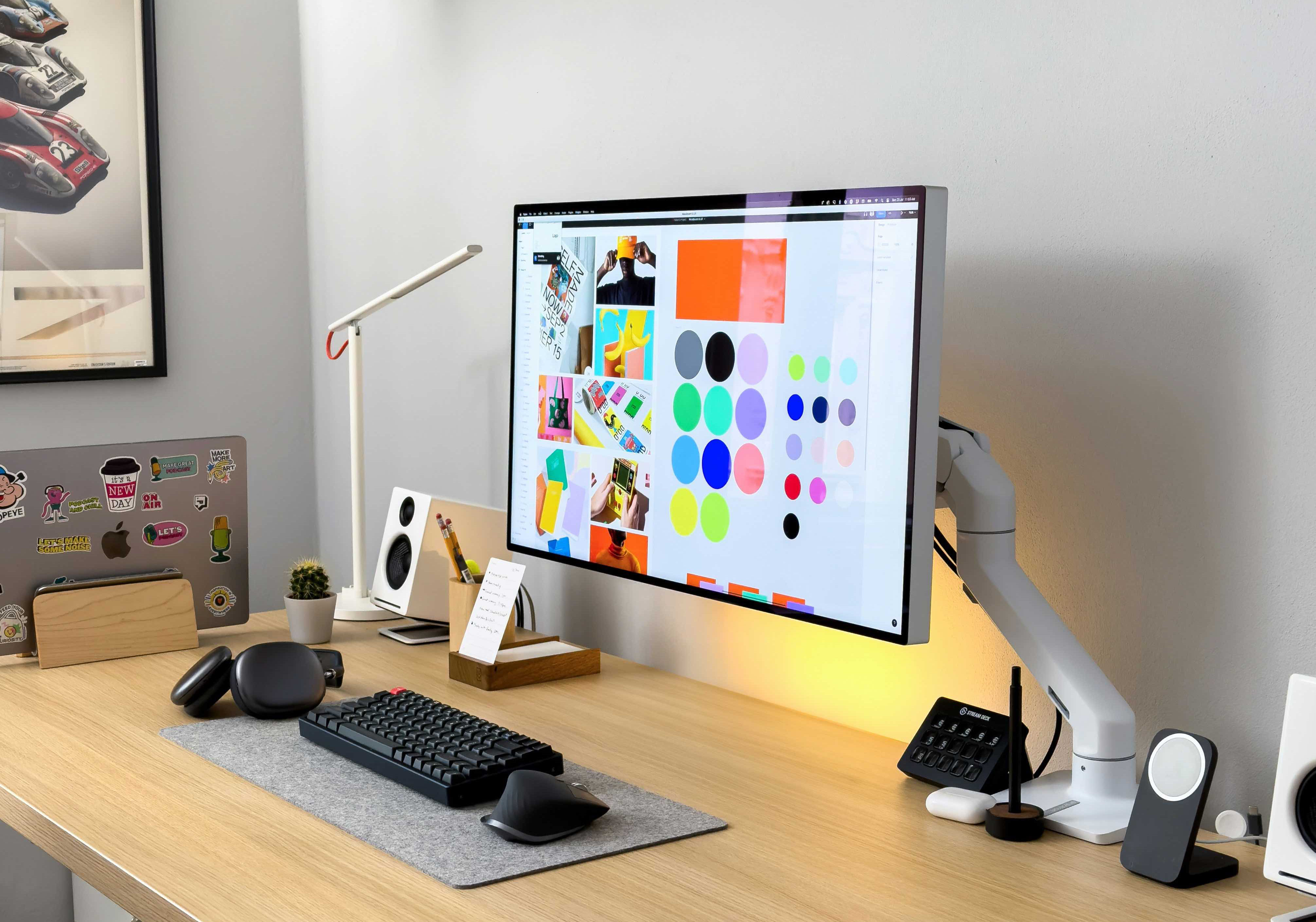
Once the moodboard feels aligned with the brand’s identity, the next step is to identify recurring or standout colors within it. This is not about copying every shade present, but about making informed choices. Professionals often look for a balance: colors that convey the right mood while also allowing flexibility in application.
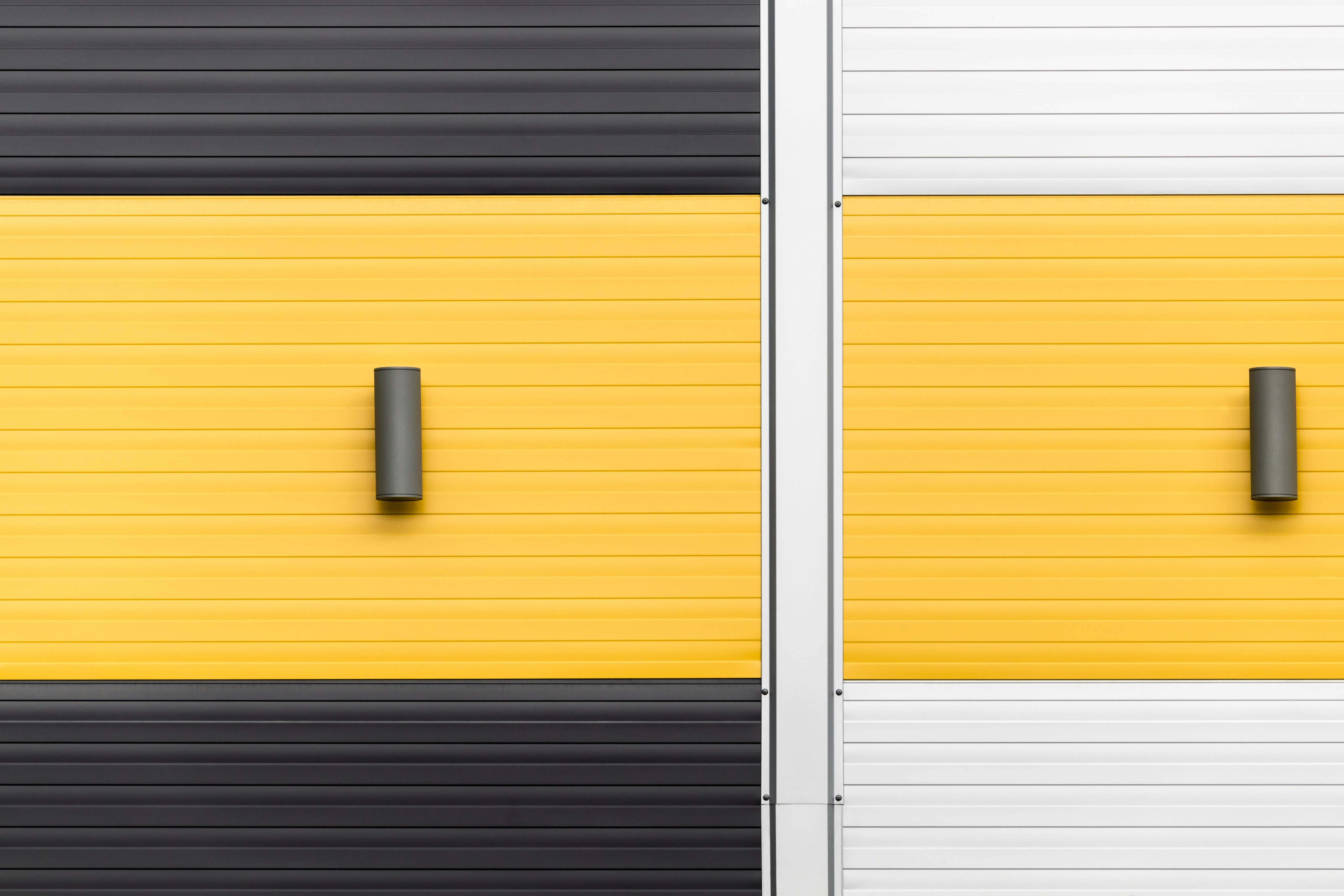
For example, a hospitality brand might draw warm, welcoming tones from interior photography, balanced with neutral shades for menus and digital interfaces. A tech brand, on the other hand, might combine bold accents inspired by futuristic visuals with a restrained, functional base. Using digital tools like Vibra Color Palette Generator can speed up this step, but the selection process remains guided by human judgment and brand objectives.
Refining the Palette into a Design Asset
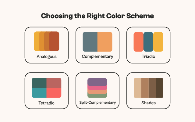
A raw collection of colors still needs structure. A professional palette typically includes a primary tone that will define most of the brand’s presence, supported by secondary and neutral tones for flexibility, and a small number of accent colors to create visual highlights. This structure is not just aesthetic — it is practical, allowing consistent use across web, print, and product design.
Accessibility checks are crucial at this stage. Designers often test contrast ratios to ensure that text remains legible, especially in digital products where usability is as important as beauty.
Testing in Context
A color can change dramatically when applied to a real-world setting. This is why professionals test their palettes in realistic mockups before final approval. A palette that works beautifully in isolation might look flat in a website header, or overwhelming in a packaging design. Testing ensures that hierarchy is preserved, that important elements stand out, and that the emotional tone established in the moodboard is still intact in practical application.
Documenting for Collaboration
The final step is documentation. A well-made palette becomes part of a brand style guide, complete with hex and RGB/CMYK codes, usage rules, and examples. This ensures consistency whether the design is being implemented by an in-house team, an external agency, or individual freelancers. In real-world projects, this documentation is as valuable as the palette itself, because it prevents costly inconsistencies in the brand’s visual communication.
When followed with intention, this workflow — from moodboard to palette — turns raw inspiration into a functional design system. It anchors creativity in strategy, ensuring that every color chosen is not only visually appealing but also aligned with the deeper identity of the brand. For professionals working in branding, marketing, and visual design, this process is not just good practice; it is essential for producing work that stands the test of time.