What you need to know
Apple’s Liquid Glass design in iOS has sparked heated discussion on Reddit. Some users praise it for bringing life and tactility back to the iPhone interface, while others criticize it for poor readability, accessibility issues, and visual clutter. Developers, meanwhile, are slow to adopt the new style, citing technical and branding concerns. Overall, users are intrigued but divided, seeing Liquid Glass as both bold and problematic.
A Shiny New Look That Surprised Many
On r/iphone, an early post titled “OK, now I get it — Liquid Glass is amazing” captured the excitement of users who have warmed up to Apple’s new aesthetic. The original poster described the interface as “fun,” “fresh,” and something that makes the iPhone feel “crafted” again.
Other commenters agreed, saying that the new translucent effects, reflections, and fluid animations make iOS feel more dynamic and engaging.
Many users disliked the design at first, only to find it appealing after a few days. The improved haptics and motion feedback were also highlighted as strong points that made interactions feel more natural.
Criticism: Style Over Function
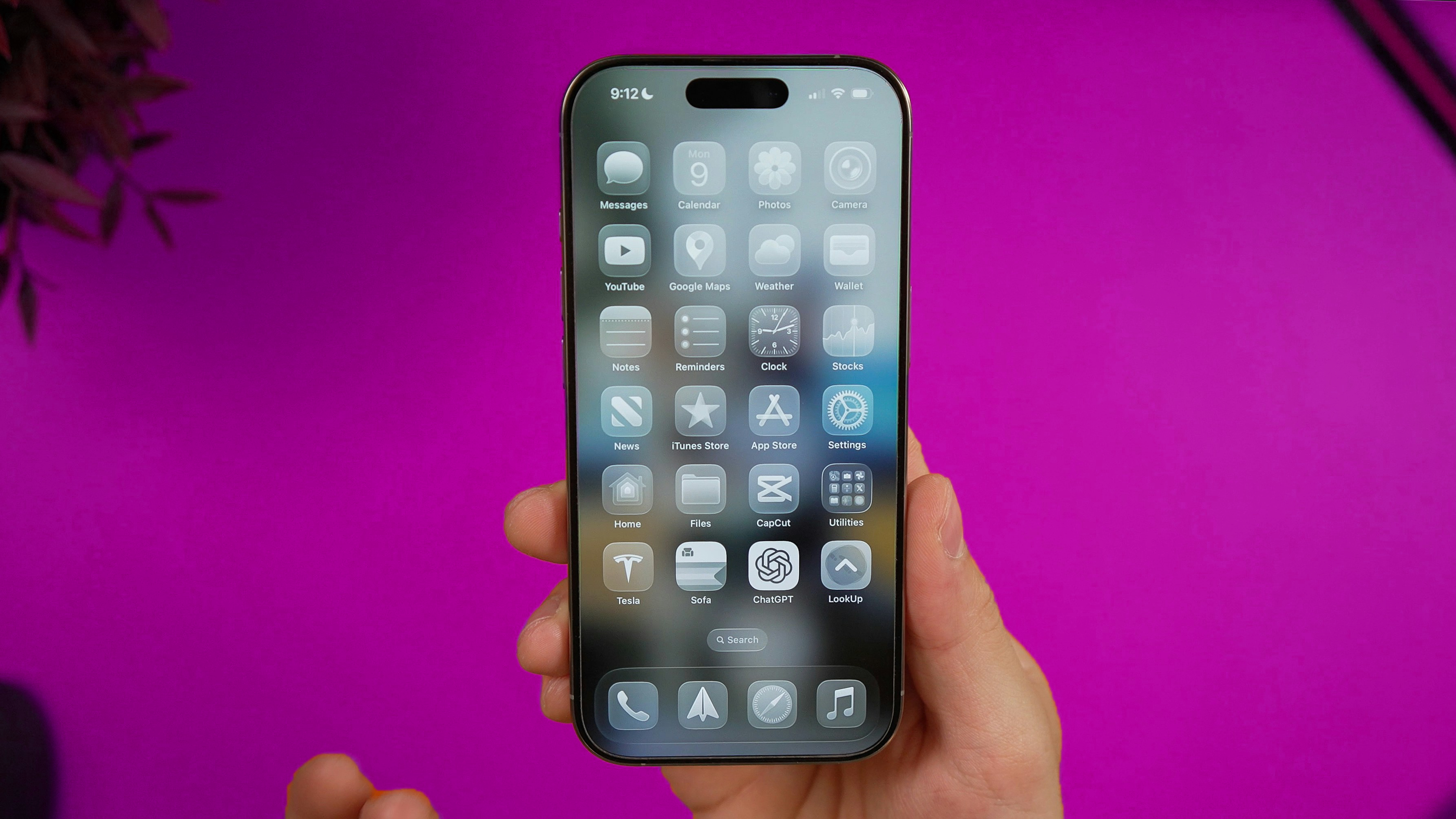
Despite some praise, a large number of users on Reddit expressed frustration with Liquid Glass. In the r/ios post “Why is Liquid Glass so hated?”, many argued that the new look sacrifices clarity for visual spectacle.
The most common complaints focus on readability and contrast. Users say text often blends into backgrounds, particularly in dark mode or over colorful wallpapers. Accessibility concerns were a recurring theme, with visually impaired users finding it difficult to navigate the new interface.
Some users wrote that it looks great in Apple’s marketing shots, but in real use, text is harder to read and notifications are unclear. Others said that the design feels like it prioritizes style over function.
Some also reported eye strain and even headaches from the constant motion and reflections. Others described the change as cosmetic, arguing that Apple is prioritizing aesthetics over usability.
Developers Are Slow to Embrace It
In another popular discussion, “Are devs actually adopting Liquid Glass?”, users examined whether app developers are implementing the new design language. The short answer: not many.
Only a few apps such as Slack, Overcast, and Infuse have introduced elements of Liquid Glass. Most developers appear cautious, citing limited time, unclear benefits, and the need to maintain visual consistency across platforms.
Several commenters noted that the Liquid Glass effects come automatically with Apple’s new SDK, but full adoption requires manual adjustments for contrast, shadows, and animation timing. For now, most apps retain a hybrid look.
A Divided Verdict
When looking across Reddit threads, the community sentiment is clearly split. Many appreciate Apple’s attempt to evolve the iOS aesthetic and make the interface feel more tactile and modern. Others view it as distracting, less functional, and potentially worse for accessibility.
Positives mentioned by users include that it is visually refreshing and modern, improves animations and haptics, and adds depth and personality to the interface.
Negatives mentioned by users include poor contrast and legibility, visual fatigue and motion discomfort, no option to disable the effect entirely, and slow and inconsistent developer adoption.
The Bottom Line
Liquid Glass represents Apple’s most ambitious visual redesign in years, but it has arrived to a cautious audience. On Reddit, users are split between admiration and frustration. Some believe the design will improve over time as Apple fine-tunes contrast and accessibility, while others see it as a step backward for usability.
One top comment summarized it as: “Liquid Glass will probably age better than it looks right now, but today it’s more interesting than it is usable.”
If Apple can refine the balance between beauty and clarity, Liquid Glass may eventually win over more users. For now, it remains one of Apple’s most polarizing visual experiments.