What you need to know
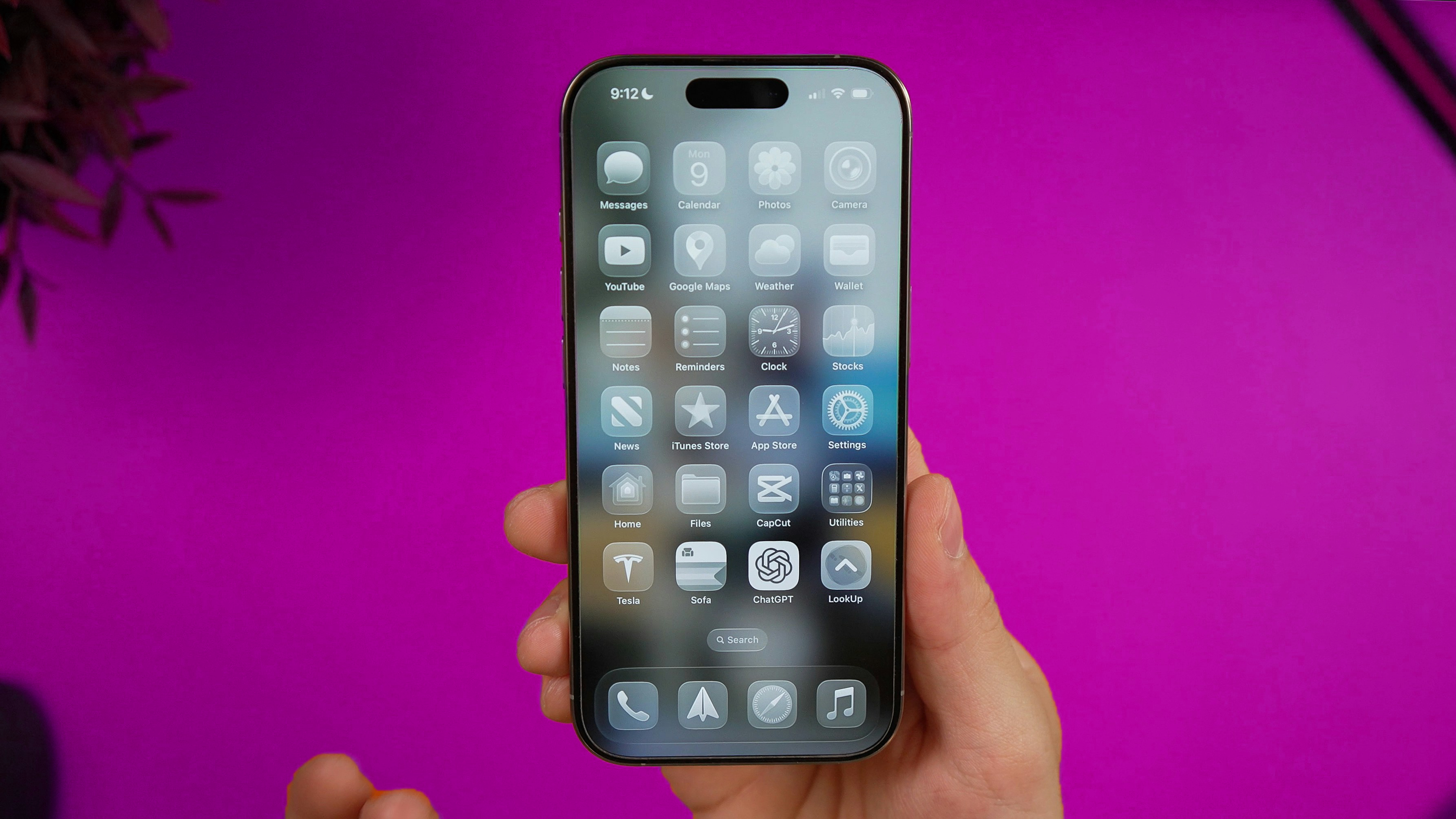
With the release of ChatGPT Atlas, OpenAI has introduced a browser that now interprets web pages. Atlas combines search, chat, and task execution in a single interface, where users can ask questions about the page they’re viewing, get summaries, and even let the AI perform actions like booking or buying.
For designers, this marks a turning point. If users begin to experience the web through an AI layer, everything we know about color, contrast, typography, and semantics evolves. We are entering an era where design must communicate both with people and with the algorithms that now mediate how people see.
What is ChatGPT Atlas?
Atlas integrates ChatGPT directly into the browsing flow. Users can open a sidebar, ask questions about any page, or request comparisons without leaving it. The new Agent Mode allows the AI to act on behalf of the user, while the memory feature remembers context from previous sessions to provide continuity.
OpenAI describes Atlas as a “contextually intelligent browser,” built on the idea that AI can understand both textual and visual aspects of a web page to assist the user. It’s a fundamental shift where the browser becomes an active participant in how we explore information.
Why designers must rethink color, typography and semantics
When people browse the web, they read layouts visually: scanning hierarchies, colors, typography, and contrast to make sense of what’s important. But in Atlas, that first reading may happen before the human even looks. The model interprets structure and meaning to decide what to summarize, highlight, or quote back to the user.
Color, then, becomes metadata. A human perceives a red button as urgency and a blue header as trust. An AI might interpret those colors as signals of interaction and hierarchy. If palettes are inconsistent, the AI may misjudge tone or importance. This doesn’t mean Atlas actively analyzes color in the way humans do, but OpenAI’s GPT-4o allows it to recognize contrast, layout, and visual cues as part of how it understands a page. From a design standpoint, that possibility alone changes how we think about clarity and consistency.
Typography and contrast remain equally critical. A design that passes accessibility checks for humans can still confuse machine readers if typographic hierarchy isn’t predictable. Clear typographic roles — body text, links, headings, alerts — ensure that both people and systems understand structure.
Semantics and structure now carry new importance. OpenAI notes that Atlas can interpret and summarize web content contextually, relying on text and visual composition. That means that well-structured HTML, clear labeling, and consistent visual patterns don’t just improve accessibility, but they help AI interpret a brand’s message correctly. A site without semantic logic risks being misunderstood, summarized inaccurately, or stripped of its intended tone. In this sense, semantics have become the bridge between human design and machine understanding.
What to expect going forward
Design systems will soon include guidance for human interaction and for AI interpretation as well: how color, contrast, and semantics convey purpose. Documentation will evolve to include “machine readability” as a design principle.
Tools like Color Palette Generator and Contrast Checker are now even more more important. They were built to ensure perceptual harmony and legibility for people, but the same structured consistency they provide also strengthens how algorithms interpret design. In an AI-mediated web, those tools help maintain the integrity of meaning — ensuring that what we design remains coherent, regardless of who, or what, is perceiving it.
Search Engine Optimization may evolve into Generative Engine Optimization, optimizing for search rankings and how AI models summarize and cite content. Designers and developers will need to test how a user experiences a page and how AI describes it.
Why this matters for color and accessibility
In a world where AI interprets as much as it displays, color takes on a dual role: visual and semantic. It’s the connective tissue that keeps meaning consistent across human and algorithmic perception. A structured, accessible color system help people with different types of vision, but it also helps AI maintain the intended relationships between hierarchy, action, and emotion.
Although today’s AI doesn’t “see” color the way we do, models like GPT-4o recognize contrast, saturation, and placement as signals of intent. That doesn’t make color interpretation a live feature of Atlas yet, but it indicates the direction design is heading. As AI becomes a mediator of user experience, maintaining clarity in color and contrast will be fundamental to inclusion and comprehension.
Color is not disappearing from digital experience. It is transforming into a shared language between humans and machines.
So who are we designing for?
The arrival of ChatGPT Atlas doesn’t mean we stop designing for humans. It means we design for both human and artificial perception. The browser is no longer a neutral frame, it’s becoming a collaborator that interprets, filters, and speaks.
Designers now shape what people see and how machines understand it. When color, contrast, typography, and structure align, our work becomes humanly intuitive and algorithmically clear. That alignment may define the next era of UX — and I am happy to see more of that in the near future.