Color is not just decoration. It is a form of language that can influence how we feel, behave and engage with digital experiences. For designers, this raises an important question: how do we choose colors that resonate with our users, not just our brand?
To answer that, we need to look beyond aesthetic trends and toward something more human. Recent research in user interface design and consumer psychology shows that individual differences—such as personality, cognitive style and even cultural background—strongly shape how people respond to color. These differences are not random. In fact, they often fall into identifiable patterns.
In this article, we explore three types of color users based on psychological and behavioral insights. Understanding these types can help you design more intuitive, emotionally satisfying and effective interfaces.
1. The Warm Empathizer
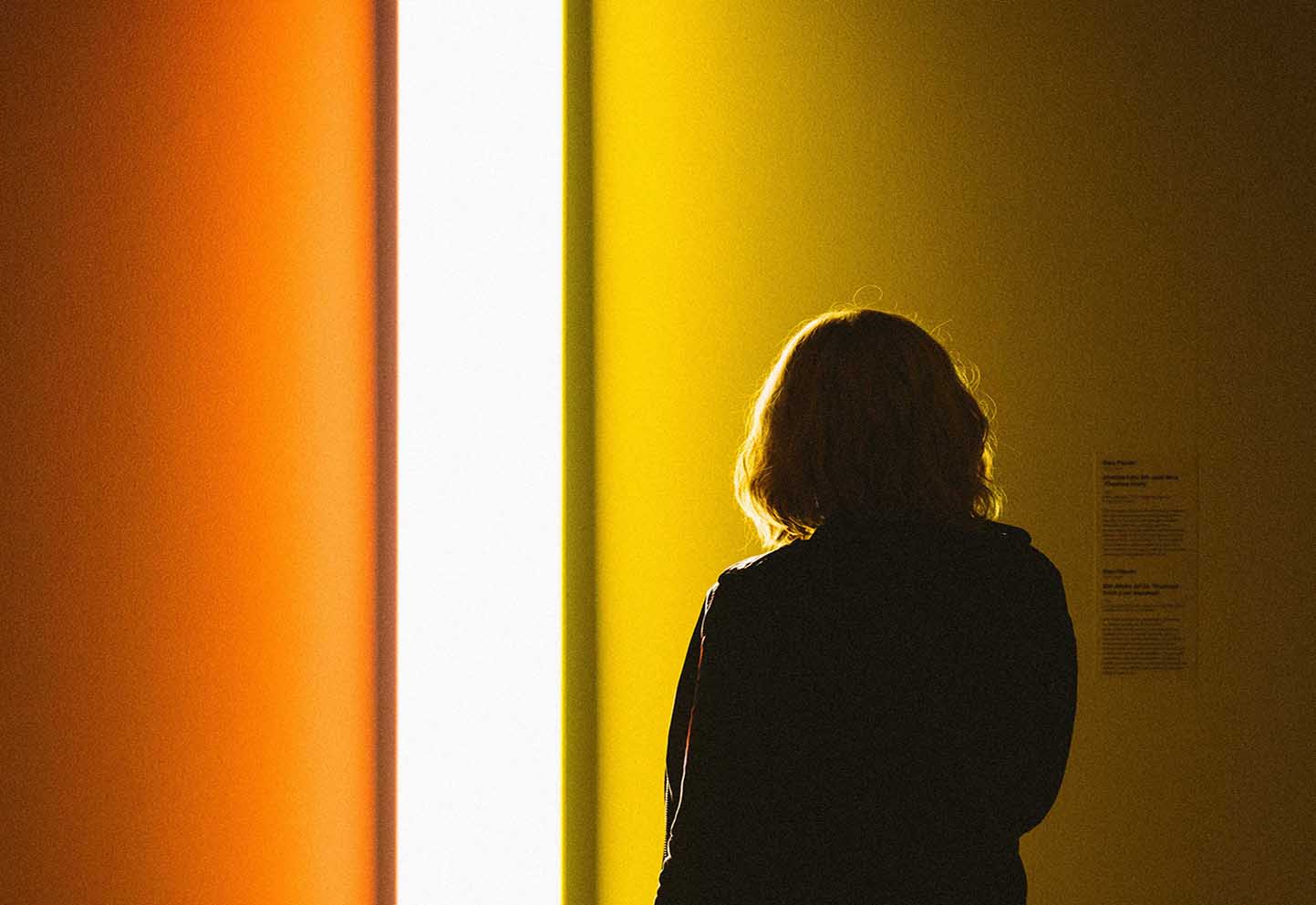
This user seeks emotional connection. Often high in traits like agreeableness and openness to others, this type of person is drawn to interfaces that feel friendly, safe and human. Warm colors—yellows, soft reds, peach, orange evoke a sense of comfort and inclusion. Rounded shapes, gentle gradients and soft lighting further enhance the experience for them.
What they need is not just functionality, but warmth. Applications related to health, community or personal journaling often resonate best with these users when paired with approachable color palettes. Too much contrast, harsh geometry or aggressive branding can create distance instead of connection.
To serve this user well, your design should say: You are welcome here.
2. The Rational Organizer
This is the user who prefers logic, structure and efficiency. Often high in conscientiousness and cognitive control, they are attracted to cool and neutral color schemes—such as blues, greys, and whites. For them, clarity matters more than creativity. They want to move through an interface quickly, understand what each element means and trust that the system will behave predictably.
Design for this group should focus on visual hierarchy, readability and low-friction interaction. Think of the dashboard, the productivity app or the enterprise tool. These users appreciate minimalism not as a style, but as a way to stay focused. Too many colors, animations or unexpected flourishes may seem like clutter.
To serve this user well, your design should say: Everything is under control.
3. The Curious Individualist
Unlike the others, this user wants the experience to reflect their own identity. They are often high in openness to experience, imagination and even a desire for uniqueness. They are drawn to bold, expressive and sometimes unconventional color schemes—purples, greens, deep blacks or even customizable themes.
This user does not just consume design. They interact with it. They enjoy personalization options, experimental aesthetics and designs that break the mold. They may be artists, early adopters or simply people who feel limited by standard templates.
Quiet luxury appeals to some of them—minimalist design with subtle details and no flashy branding—while others want maximalism, with full visual richness. In both cases, the common thread is self-expression.
To serve this user well, your design should say: This space can become yours.
Personalization starts with understanding
In practice, people are complex. No user fits perfectly into one category. But recognizing these patterns helps avoid one-size-fits-all thinking. Color is emotional, and emotions differ.
Research from Delft University and ACM studies show that when color schemes match user traits, people feel more comfortable, more engaged and even more loyal to the product. In one study, introverted users consistently preferred calm blue interfaces, while imaginative users preferred black or vibrant themes. Another study confirmed that personalizing color choices to fit a user's psychological profile significantly improved their experience.
The conclusion is simple: personalization works. And color is a low-cost, high-impact way to start.
Designing for All Three
You do not need to redesign your entire product to meet the needs of every type. But small adjustments can go a long way. Consider offering theme options. Allow subtle tweaks to color, brightness or contrast. Or design with a primary type in mind, while testing with others to ensure no one feels alienated.
Ultimately, great design does not just look good. It feels right. By understanding who your users are—and how they relate to color, you can create interfaces that are not just functional, but meaningful.
Curious which colors fit each user type? Start with the Colors Gallery to explore base hues, then build your own palette using our palette generator.